In this project walkthrough, we’ll explore how to build a linear regression model to predict patient medical insurance costs. By analyzing demographic and health data, we’ll develop a predictive model that could help hospitals and insurance companies forecast costs and allocate resources more effectively.
Predicting medical costs is a challenge in healthcare administration. Accurate predictions enable better budget planning, resource allocation, and pricing strategies. Through this hands-on project, we’ll work through the entire machine learning pipeline—from exploratory data analysis to model evaluation and interpretation.
What makes this project particularly interesting is that we’ll discover some surprising patterns in the data that challenge our initial assumptions about linear regression, leading us to explore creative solutions for improving model performance.
What You’ll Learn
By the end of this tutorial, you’ll know how to:
- Perform exploratory data analysis to understand relationships in healthcare data
- Transform skewed data using logarithmic transformations
- Build and evaluate linear regression models using scikit-learn
- Diagnose model issues using residual analysis
- Interpret model coefficients to derive business insights
- Identify when linear regression might not be the best choice
- Apply domain knowledge to improve model performance
Before You Start
To make the most of this project walkthrough, follow these preparatory steps:
-
Review the Project
Access the project and familiarize yourself with the goals and structure: Predicting Insurance Costs Project.
-
Prepare Your Environment
- If you’re using the Dataquest platform, everything is already set up for you
- If working locally, ensure you have Python and the required libraries installed:
pandas,numpy,matplotlib,seaborn, andsklearn
- Download the
insurance.csvdataset from the project or from Kaggle
-
Prerequisites
New to Markdown? We recommend learning the basics to format headers and add context to your Jupyter notebook: Markdown Guide.
Setting Up Your Environment
Let’s begin by importing the necessary libraries and loading our dataset:
import pandas as pd
import numpy as np
import matplotlib.pyplot as plt
import seaborn as sns
from sklearn.model_selection import train_test_split
from sklearn.linear_model import LinearRegression
from sklearn.metrics import mean_squared_error, r2_score

# Load the insurance dataset
insurance = pd.read_csv('insurance.csv')
insurance.head()
age sex bmi children smoker region charges
0 19 female 27.900 0 yes southwest 16884.92400
1 18 male 33.770 1 no southeast 1725.55230
2 28 male 33.000 3 no southeast 4449.46200
3 33 male 22.705 0 no northwest 21984.47061
4 32 male 28.880 0 no northwest 3866.85520Our dataset contains information about individual medical insurance bills with the following features:
- age: Age of the primary beneficiary
- sex: Gender of the beneficiary (male/female)
- bmi: Body Mass Index, calculated as weight(kg) / height(m)²
- children: Number of children/dependents covered by the insurance
- smoker: Whether the beneficiary smokes (yes/no)
- region: The beneficiary’s residential area in the US (northeast, southeast, southwest, northwest)
- charges: Individual medical costs billed by health insurance (our target variable)
Exploratory Data Analysis (EDA)
Before building any model, we need to understand our data thoroughly. Let’s start by examining the structure and checking for missing values:
insurance.info()
RangeIndex: 1338 entries, 0 to 1337
Data columns (total 7 columns):
 #   Column    Non-Null Count  Dtype
---  ------    --------------  -----
 0   age       1338 non-null   int64
 1   sex       1338 non-null   object
 2   bmi       1338 non-null   float64
 3   children  1338 non-null   int64
 4   smoker    1338 non-null   object
 5   region    1338 non-null   object
 6   charges   1338 non-null   float64
dtypes: float64(2), int64(2), object(3)
memory usage: 73.3+ KB
Great! We have 1,338 records with no missing values—a clean dataset that won’t require imputation. Notice that sex, smoker, and region are object types (categorical variables) that we’ll need to convert to numerical data before our model can use them.
Learning Insight: Coming from a teaching background, I’ve learned that clean data is rare in the real world. This dataset being so clean might indicate it’s synthetic data, which we should keep in mind as we analyze patterns. Real healthcare data often has missing values, inconsistencies, and outliers that require careful handling.
Let’s examine the summary statistics for our numeric variables:
insurance.describe() age bmi children charges
count 1338.000000 1338.000000 1338.000000 1338.000000
mean 39.207025 30.663397 1.094918 13270.422265
std 14.049960 6.098187 1.205493 12110.011237
min 18.000000 15.960000 0.000000 1121.873900
25% 27.000000 26.296250 0.000000 4740.287150
50% 39.000000 30.400000 1.000000 9382.033000
75% 51.000000 34.693750 2.000000 16639.912515
max 64.000000 53.130000 5.000000 63770.428010
A key insight from the summary statistics is the difference between mean and median charges. The mean (\$13,270) is significantly higher than the median (\$9,382), suggesting right skew in our target variable.
Learning Insight: For linear regression, this skew can lead to poor predictions because the algorithm assumes errors are normally distributed.
Let’s visualize the distribution of charges:
insurance.hist('charges')
plt.show()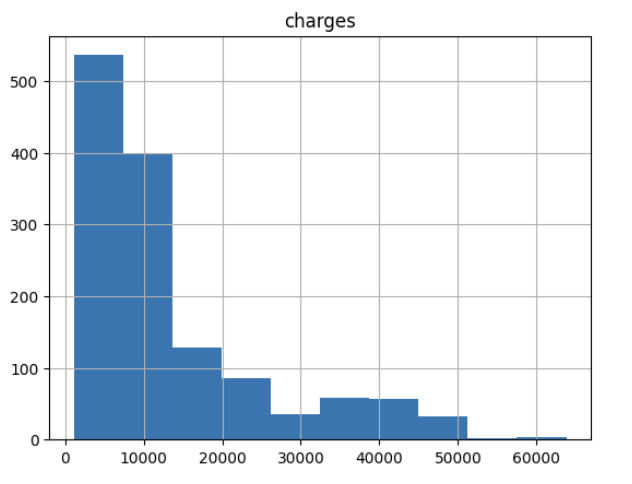
The histogram confirms our suspicion; the charges are heavily right-skewed with a long tail of expensive medical bills. This makes it unlikely that the errors in the model will truly be centered at zero. It might be worth it to log-transform the outcome.
insurance["log_charges"] = np.log2(insurance["charges"])

insurance.hist("log_charges")
plt.show()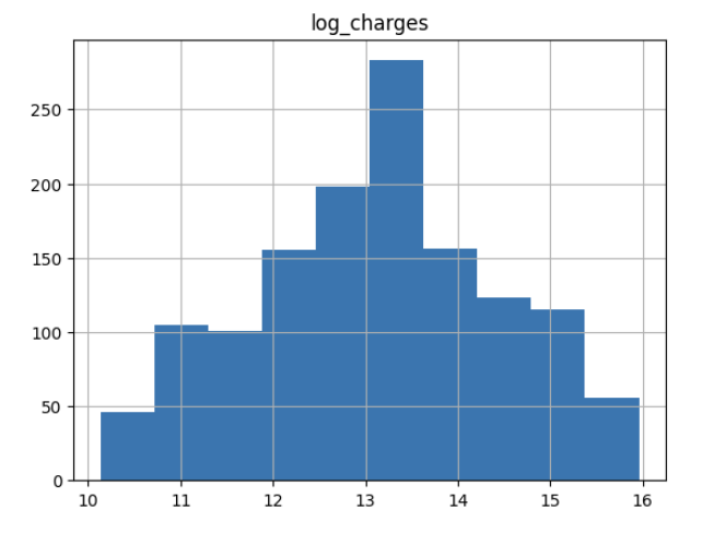
The log-transformed charges show a much more normal distribution, which should help our linear regression model perform better.
Learning Insight: I chose base-2 logarithm here, but you could use natural log (
np.log) with similar results. The key is consistency—if you transform with log2, remember to inverse-transform with2^xwhen interpreting results. It’s like choosing between Celsius and Fahrenheit—both work, but mixing them causes problems!
Feature Selection
Now let’s examine correlations between our variables to identify potential predictors:
correlations = insurance.corr()
correlations
age bmi children charges log_charges
age 1.000000 0.109272 0.042469 0.299008 0.527834
bmi 0.109272 1.000000 0.012759 0.198341 0.132669
children 0.042469 0.012759 1.000000 0.067998 0.161336
charges 0.299008 0.198341 0.067998 1.000000 0.892964
log_charges 0.527834 0.132669 0.161336 0.892964 1.000000sns.heatmap(correlations, cmap='Blues', annot=True)
plt.show()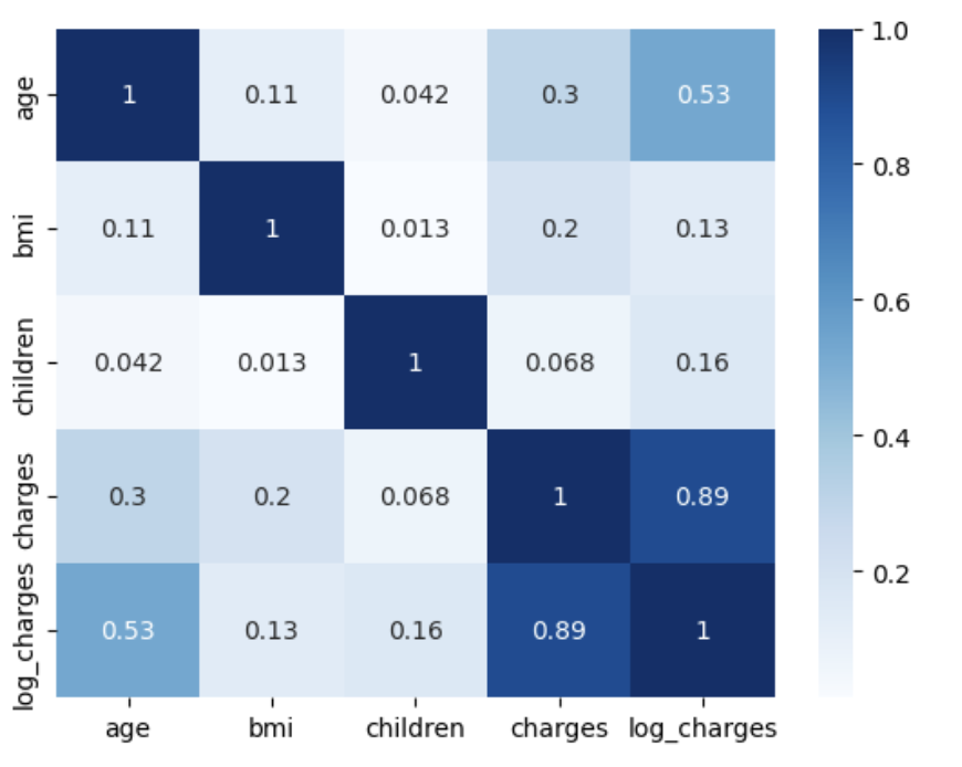
Key observations from the correlation matrix:
- Age has a 52.8% correlation with
log_charges(much stronger than the 29.9% with rawcharges) - BMI shows weaker correlation (13.3% with
log_charges) - Children has minimal correlation (16.1% with
log_charges)
Let’s visualize relationships using a pair plot:
insurance_numeric = insurance[['age', 'bmi', 'children', 'charges', 'log_charges']]
sns.pairplot(insurance_numeric, kind='scatter', plot_kws={'alpha': 0.4})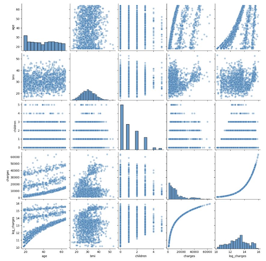
Learning Insight: The pair plot revealed something that made me say “whoa!”—look at the age vs charges relationship. Those aren’t random scatter points; there are three distinct bands or clusters. This was my first clue that simple linear regression might struggle with this data. In my experience as a data analyst, when you see patterns like this, it often means there’s a hidden categorical variable creating different groups in your data.
Now let’s examine our categorical variables using box plots:
insurance.boxplot(column=["log_charges"], by="sex")
plt.show()

insurance.boxplot(column=["log_charges"], by="smoker")
plt.show()

insurance.boxplot(column=["log_charges"], by="region")
plt.show()
The box plots reveal:
- Sex: Males seem to have a wider distribution of charges compared to women
- Smoker: Smokers have much higher costs than non-smokers
- Region: There doesn’t seem to be many appreciable differences between regions
Learning Insight: The
smokervariable shows such a dramatic difference that it made me wonder if we’re really looking at two different populations. From experience, I’ve learned that when one variable dominates like this, it’s often a good idea to split the data and train two separate models since each subset could have differing relationships.
Based on the univariate relationships shown above, age, bmi, and smoker are positively associated with higher charges. We’ll include these predictors in our final model.
Dividing the Data
Let’s convert our categorical smoker variable to numeric and split our data:
python
# Splitting the data up into a training and test set
insurance["is_smoker"] = (insurance["smoker"] == "yes")
# insurance["is_male"] = (insurance['sex'] == 'male')# insurance['is_west'] = ((insurance['region'] == 'northwest') | (insurance['region'] == 'southwest'))

X = insurance[["age", "bmi", "is_smoker"]]
y = insurance["log_charges"]

# 75% for training set, 25% for test set
X_train, X_test, y_train, y_test = train_test_split(X, y, test_size=0.25,
                                                    random_state=42)
Learning Insight: Notice the commented-out code in the solution notebook for is_male and is_west. This shows good exploratory thinking—the analyst considered these features but ultimately decided they weren’t necessary based on the boxplot analysis. Sometimes what you don’t include is as important as what you do!
Building the Model
Now we’ll create and train our linear regression model:
insurance_model = LinearRegression()
insurance_model.fit(X_train, y_train)
insurance_model.coef_
array([0.0508618 , 0.01563733, 2.23214787])The coefficients tell us:
- Each year of age increases
log_chargesby 0.051 - Each unit of BMI increases
log_chargesby 0.016 - Being a smoker increases
log_chargesby 2.232 (a massive effect!)
Let’s evaluate our model’s performance:
y_pred = insurance_model.predict(X_train)
train_mse = mean_squared_error(y_train, y_pred)
train_mse0.44791919632992105# MSE on the original scale for the insurance charges
train_mse_orig_scale = np.exp(mean_squared_error(y_train, y_pred))
train_mse_orig_scale1.565052228580154train_r2 = r2_score(y_train, y_pred)
train_r20.7433336007728248The training MSE for the model is 0.448 and is 1.57 on the original scale. The R² indicates that the model can explain 74% of the variation in the log-insurance charges. These preliminary results are promising, but we must remember that these are optimistic values.
Residual Diagnostics
Let’s examine the actual versus predicted values as well as the residuals to check our model assumptions:
# Create a DataFrame with predictions and actual values for easier plotting
plot_df = pd.DataFrame({
    'predictions': y_pred,
    'actual': y_train,
    'is_smoker': X_train['is_smoker'],
    'age': X_train['age'],
    'bmi': X_train['bmi'],
    'residuals': y_train - y_pred,
})

# Create scatter plot
plt.figure(figsize=(10, 6))
sns.scatterplot(x='predictions', y='actual',
                data=plot_df, alpha=0.7)

plt.xlabel('Predicted log_charges')
plt.ylabel('Actual log_charges')

plt.show()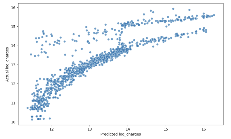
This plot reveals a concerning pattern—instead of points clustering around a straight diagonal line, we see a curved relationship. This suggests our linear model isn’t capturing the true relationship in the data.
Learning Insight: This was my “aha!” moment. Despite the decent R² score, the curved pattern tells us our model is systematically over-predicting for some values and under-predicting for others. It’s like using a straight ruler to measure a curved road—you’ll get a measurement, but it won’t be accurate.
Let’s examine the residuals more closely:
sns.scatterplot(x='predictions', y='residuals',
                data=plot_df, alpha=0.7)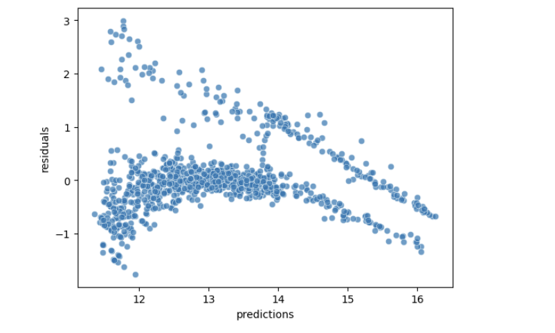
The residuals suggest some violations to the assumptions of linear regression. As predicted values get larger, the residuals trend downward. We expect an even band, centered around zero. This does not necessarily make the model predictions unusable, but it puts into question the linear regression assumptions.
Learning Insight: In a well-specified linear regression model, this plot should look like a random cloud of points around zero—what we call “white noise.” Instead, we see a clear downward trend. This violates the assumption of homoscedasticity (constant variance of errors) and suggests our model specification needs improvement.
Interpreting the Model
Let’s interpret our current model coefficients:
cdf = pd.DataFrame(insurance_model.coef_, X.columns, columns=['Coef'])
print(cdf)
Coef
age 0.050862
bmi 0.015637
is_smoker 2.232148insurance_model.intercept_10.199942936238687The linear regression equation is:
log_charges = 10.200 + 0.051×age + 0.016×bmi + 2.232×is_smokerLearning Insight: The
smokercoefficient (2.232) dominates the others. Since we’re in log space, this means being a smoker multiplies your expected charges by 2^2.232 ≈ 4.7 times! This may explain why we see such distinct groups in our predictions.
Final Model Evaluation
Let’s evaluate our model on the test set:
test_pred = insurance_model.predict(X_test)

mean_squared_error(y_test, test_pred)0.4529281560931769# Putting the outcome (in log-terms) back into the original scale
np.exp2(mean_squared_error(y_test, test_pred))1.368815646563475While the MSE seems low, remember that our residual analysis revealed serious model violations.
Segmenting by Smoker Status
Given the distinct patterns for smokers, let’s build a separate model just for this group:
smokers_df = insurance[insurance["is_smoker"] == True]
X = smokers_df[["age", "bmi"]]
y = smokers_df["log_charges"]

# 75% for training set, 25% for test set
X_train, X_test, y_train, y_test = train_test_split(X, y, test_size=0.25,
                                                    random_state=42)
smoker_model = LinearRegression()
smoker_model.fit(X_train, y_train)
smoker_model.coef_array([0.01282851, 0.07098738])Notice how the coefficients changed! For smokers:
- Age effect dropped from 0.051 to 0.013
- BMI effect increased from 0.016 to 0.071
This confirms that the relationships between predictors and costs are fundamentally different for smokers.
y_pred = smoker_model.predict(X_train)
train_mse = mean_squared_error(y_train, y_pred)
train_mse0.07046354357369704train_r2 = r2_score(y_train, y_pred)
train_r20.7661650418251628Learning Insight: The improvement is dramatic—MSE dropped from 0.448 to 0.070, an 84% reduction! This confirms our hypothesis that smokers and non-smokers follow different cost patterns. In my data analysis work, I’ve learned that sometimes the best model isn’t the most complex one, but rather separate simple models for different groups.
Let’s check if the actual versus predicted values and the residual patterns improved:
# Create a DataFrame with predictions and actual values for easier plotting
plot_df = pd.DataFrame({
    'predictions': y_pred,
    'actual': y_train,
    'age': X_train['age'],
    'bmi': X_train['bmi'],
    'residuals': y_train - y_pred,
})

# Create scatter plot
plt.figure(figsize=(10, 6))
sns.scatterplot(x='predictions', y='actual',
                data=plot_df, alpha=0.7)

plt.xlabel('Predicted log_charges')
plt.ylabel('Actual log_charges')

plt.show()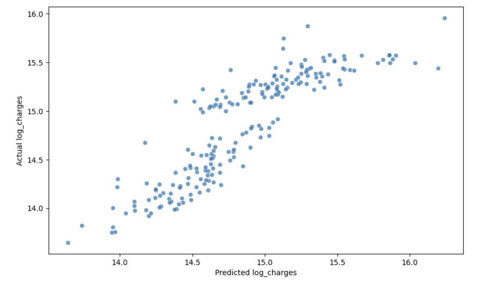
sns.scatterplot(x='predictions', y='residuals',
                data=plot_df, alpha=0.7)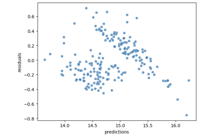
While not perfect, the residual pattern is much more random than our original model—a significant improvement!
test_pred = smoker_model.predict(X_test)

mean_squared_error(y_test, test_pred)0.09416078156173782Key Insights and Takeaways
Through this analysis, we’ve learned several critical lessons:
- Data Transformation Matters: Log-transforming our skewed target variable was essential for meeting linear regression assumptions. Without this step, our predictions would have been dominated by outliers.
- Always Check Residuals: Despite good R² values, residual analysis revealed serious model violations that metrics alone didn’t capture. This is why visual diagnostics are so important.
- Domain Knowledge Helps: Recognizing that smoking status fundamentally changes the relationship between predictors and costs led to a better modeling approach.
- One Size Doesn’t Fit All: Building separate models for distinct groups (smokers vs non-smokers) dramatically improved performance. Sometimes, multiple simple models outperform a single complex model.
This project reinforced an important lesson: just like students learn differently, data behaves differently in different contexts. The key is recognizing when to adapt your approach rather than forcing a one-size-fits-all solution.
Next Steps
To further improve this analysis, consider these challenges:
- Clustering Analysis: Use k-means or Gaussian Mixture Models to identify the distinct bands visible in the age vs charges plot
- Non-Smoker Model: Build a separate model for non-smokers and compare performance
- Cross-Validation: Implement k-fold cross-validation to get more robust performance estimates
- Alternative Models: Try Random Forests or XGBoost, which can naturally handle non-linear patterns and interactions
- Feature Engineering: Create age groups or BMI categories based on medical standards
Sharing Your Work
When you complete this project, consider sharing it on GitHub as a Jupyter notebook. Include:
- Clear markdown explanations of each step
- Visualizations that tell the story
- Your interpretation of the results
- Ideas for future improvements
This project demonstrates that real-world data often violates the assumptions of simple models. Success in machine learning requires not just applying algorithms, but understanding their assumptions, diagnosing problems, and creatively adapting your approach based on what the data tells you.
If you’re new to Python and found this project challenging, start with our Python Basics for Data Analysis skill path. For those comfortable with Python but new to machine learning, our Machine Learning Fundamentals course covers the essential concepts used in this analysis.
Remember, the journey from good model metrics to actual insights requires curiosity, persistence, and a willingness to challenge your assumptions.
Happy modeling!