In this project walkthrough, we’ll explore how to clean and analyze real survey data using Python and pandas, while diving into the fascinating world of Star Wars fandom. By working with survey results from FiveThirtyEight, we’ll uncover insights about viewer preferences, film rankings, and demographic trends that go beyond the obvious.
Survey data analysis is a critical skill for any data analyst. Unlike clean, structured datasets, survey responses come with unique challenges: inconsistent formatting, mixed data types, checkbox responses that need strategic handling, and missing values that tell their own story. This project tackles these real-world challenges head-on, preparing you for the messy datasets you’ll encounter in your career.
Throughout this tutorial, we’ll build professional-quality visualizations that tell a compelling story about Star Wars fandom, demonstrating how proper data cleaning and thoughtful visualization design can transform raw survey data into stakeholder-ready insights.
Why This Project Matters
Survey analysis represents a core data science skill applicable across industries. Whether you’re analyzing customer satisfaction surveys, employee engagement data, or market research, the techniques demonstrated here form the foundation of professional data analysis:
- Data cleaning proficiency for handling messy, real-world datasets
- Boolean conversion techniques for survey checkbox responses
- Demographic segmentation analysis for uncovering group differences
- Professional visualization design for stakeholder presentations
- Insight synthesis for translating data findings into business intelligence
The Star Wars theme makes learning enjoyable, but these skills transfer directly to business contexts. Master these techniques, and you’ll be prepared to extract meaningful insights from any survey dataset that crosses your desk.
By the end of this tutorial, you’ll know how to:
- Clean messy survey data by mapping yes/no columns and converting checkbox responses
- Handle unnamed columns and create meaningful column names for analysis
- Use boolean mapping techniques to avoid data corruption when re-running Jupyter cells
- Calculate summary statistics and rankings from survey responses
- Create professional-looking horizontal bar charts with custom styling
- Build side-by-side comparative visualizations for demographic analysis
- Apply object-oriented Matplotlib for precise control over chart appearance
- Present clear, actionable insights to stakeholders
Before You Start: Pre-Instruction
To make the most of this project walkthrough, follow these preparatory steps:
Review the Project
Access the project and familiarize yourself with the goals and structure: Star Wars Survey Project
Access the Solution Notebook
You can view and download it here to see what we’ll be covering: Solution Notebook
Prepare Your Environment
- If you’re using the Dataquest platform, everything is already set up for you
- If working locally, ensure you have Python with pandas, matplotlib, and numpy installed
- Download the dataset from the FiveThirtyEight GitHub repository
Prerequisites
- Comfortable with Python basics and pandas DataFrames
- Familiarity with dictionaries, loops, and methods in Python
- Basic understanding of Matplotlib (we’ll use intermediate techniques)
- Understanding of survey data structure is helpful, but not required
New to Markdown? We recommend learning the basics to format headers and add context to your Jupyter notebook: Markdown Guide.
Setting Up Your Environment
Let’s begin by importing the necessary libraries and loading our dataset:
import pandas as pd
import numpy as np
import matplotlib.pyplot as plt
%matplotlib inline
The %matplotlib inline command is Jupyter magic that ensures our plots render directly in the notebook. This is essential for an interactive data exploration workflow.
star_wars = pd.read_csv("star_wars.csv")
star_wars.head()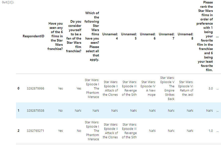
Our dataset contains survey responses from over 1,100 respondents about their Star Wars viewing habits and preferences.
Learning Insight: Notice the unnamed columns (Unnamed: 4, Unnamed: 5, etc.) and extremely long column names? This is typical of survey data exported from platforms like SurveyMonkey. The unnamed columns actually represent different movies in the franchise, and cleaning these will be our first major task.
The Data Challenge: Survey Structure Explained
Survey data presents unique structural challenges. Consider this typical survey question:
“Which of the following Star Wars films have you seen? Please select all that apply.”
This checkbox-style question gets exported as multiple columns where:
- Column 1 contains “Star Wars: Episode I The Phantom Menace” if selected, NaN if not
- Column 2 contains “Star Wars: Episode II Attack of the Clones” if selected, NaN if not
- And so on for all six films…
This structure makes analysis difficult, so we’ll transform it into clean boolean columns.
Data Cleaning Process
Step 1: Converting Yes/No Responses to Booleans
Survey responses often come as text (“Yes”/”No”) but boolean values (True/False) are much easier to work with programmatically:
yes_no = {"Yes": True, "No": False, True: True, False: False}

for col in [
    "Have you seen any of the 6 films in the Star Wars franchise?",
    "Do you consider yourself to be a fan of the Star Wars film franchise?",
    "Are you familiar with the Expanded Universe?",
    "Do you consider yourself to be a fan of the Star Trek franchise?"
]:
    star_wars[col] = star_wars[col].map(yes_no, na_action='ignore')
Learning Insight: Why the seemingly redundant True: True, False: False entries? This prevents overwriting data when re-running Jupyter cells. Without these entries, if you accidentally run the cell twice, all your True values would become NaN because the mapping dictionary no longer contains True as a key. This is a common Jupyter pitfall that can silently destroy your analysis!
Step 2: Transforming Movie Viewing Data
The trickiest part involves converting the checkbox movie data. Each unnamed column represents whether someone has seen a specific Star Wars episode:
movie_mapping = {
    "Star Wars: Episode I  The Phantom Menace": True,
    np.nan: False,
    "Star Wars: Episode II  Attack of the Clones": True,
    "Star Wars: Episode III  Revenge of the Sith": True,
    "Star Wars: Episode IV  A New Hope": True,
    "Star Wars: Episode V The Empire Strikes Back": True,
    "Star Wars: Episode VI Return of the Jedi": True,
    True: True,
    False: False
}

for col in star_wars.columns[3:9]:
    star_wars[col] = star_wars[col].map(movie_mapping)
Step 3: Strategic Column Renaming
Long, unwieldy column names make analysis difficult. We’ll rename them to something manageable:
star_wars = star_wars.rename(columns={
    "Which of the following Star Wars films have you seen? Please select all that apply.": "seen_1",
    "Unnamed: 4": "seen_2",
    "Unnamed: 5": "seen_3",
    "Unnamed: 6": "seen_4",
    "Unnamed: 7": "seen_5",
    "Unnamed: 8": "seen_6"
})
We’ll also clean up the ranking columns:
star_wars = star_wars.rename(columns={
    "Please rank the Star Wars films in order of preference with 1 being your favorite film in the franchise and 6 being your least favorite film.": "ranking_ep1",
    "Unnamed: 10": "ranking_ep2",
    "Unnamed: 11": "ranking_ep3",
    "Unnamed: 12": "ranking_ep4",
    "Unnamed: 13": "ranking_ep5",
    "Unnamed: 14": "ranking_ep6"
})
Analysis: Uncovering the Data Story
Which Movie Reigns Supreme?
Let’s calculate the average ranking for each movie. Remember, in ranking questions, lower numbers indicate higher preference:
mean_ranking = star_wars[star_wars.columns[9:15]].mean().sort_values()
print(mean_ranking)
ranking_ep5 2.513158
ranking_ep6 3.047847
ranking_ep4 3.272727
ranking_ep1 3.732934
ranking_ep2 4.087321
ranking_ep3 4.341317The results are decisive: Episode V (The Empire Strikes Back) emerges as the clear fan favorite with an average ranking of 2.51. The original trilogy (Episodes IV-VI) significantly outperforms the prequel trilogy (Episodes I-III).
Movie Viewership Patterns
Which movies have people actually seen?
total_seen = star_wars[star_wars.columns[3:9]].sum()
print(total_seen)
seen_1 673
seen_2 571
seen_3 550
seen_4 607
seen_5 758
seen_6 738Episodes V and VI lead in viewership, while the prequels show notably lower viewing numbers. Episode III has the fewest viewers at 550 respondents.
Professional Visualization: From Basic to Stakeholder-Ready
Creating Our First Chart
Let’s start with a basic visualization and progressively enhance it:
plt.bar(range(6), star_wars[star_wars.columns[3:9]].sum())This creates a functional chart, but it’s not ready for stakeholders. Let’s upgrade to object-oriented Matplotlib for precise control:
fig, ax = plt.subplots(figsize=(6,3))
rankings = ax.barh(mean_ranking.index, mean_ranking, color='#fe9b00')

ax.set_facecolor('#fff4d6')
ax.set_title('Average Ranking of Each Movie')

for spine in ['top', 'right', 'bottom', 'left']:
    ax.spines[spine].set_visible(False)

ax.invert_yaxis()
ax.text(2.6, 0.35, '*Lowest rank is the mostn liked', fontstyle='italic')

plt.show()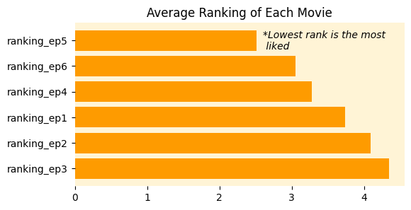
Learning Insight: Think of fig as your canvas and ax as a panel or chart area on that canvas. Object-oriented Matplotlib might seem intimidating initially, but it provides precise control over every visual element. The fig object handles overall figure properties while ax controls individual chart elements.
Advanced Visualization: Gender Comparison
Our most sophisticated visualization compares rankings and viewership by gender using side-by-side bars:
# Create gender-based dataframes
males = star_wars[star_wars["Gender"] == "Male"]
females = star_wars[star_wars["Gender"] == "Female"]

# Calculate statistics for each gender
male_ranking_avgs = males[males.columns[9:15]].mean()
female_ranking_avgs = females[females.columns[9:15]].mean()
male_tot_seen = males[males.columns[3:9]].sum()
female_tot_seen = females[females.columns[3:9]].sum()

# Create side-by-side comparison
ind = np.arange(6)
height = 0.35
offset = ind + height

fig, ax = plt.subplots(1, 2, figsize=(8,4))

# Rankings comparison
malebar = ax[0].barh(ind, male_ranking_avgs, color='#fe9b00', height=height)
femalebar = ax[0].barh(offset, female_ranking_avgs, color='#c94402', height=height)
ax[0].set_title('Movie Rankings by Gender')
ax[0].set_yticks(ind + height / 2)
ax[0].set_yticklabels(['Episode 1', 'Episode 2', 'Episode 3', 'Episode 4', 'Episode 5', 'Episode 6'])
ax[0].legend(['Men', 'Women'])

# Viewership comparison
male2bar = ax[1].barh(ind, male_tot_seen, color='#ff1947', height=height)
female2bar = ax[1].barh(offset, female_tot_seen, color='#9b052d', height=height)
ax[1].set_title('# of Respondents by Gender')
ax[1].set_xlabel('Number of Respondents')
ax[1].legend(['Men', 'Women'])

plt.show()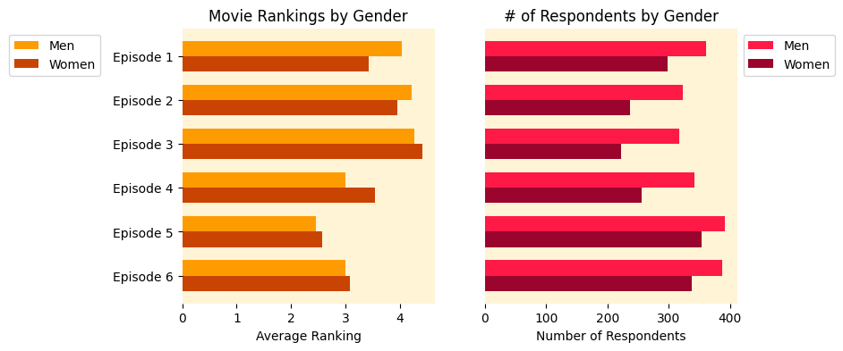
Learning Insight: The offset technique (ind + height) is the key to creating side-by-side bars. This shifts the female bars slightly down from the male bars, creating the comparative effect. The same axis limits ensure fair visual comparison between charts.
Key Findings and Insights
Through our systematic analysis, we’ve discovered:
Movie Preferences:
- Episode V (Empire Strikes Back) emerges as the definitive fan favorite across all demographics
- The original trilogy significantly outperforms the prequels in both ratings and viewership
- Episode III receives the lowest ratings and has the fewest viewers
Gender Analysis:
- Both men and women rank Episode V as their clear favorite
- Gender differences in preferences are minimal but consistently favor male engagement
- Men tended to rank Episode IV slightly higher than women
- More men have seen each of the six films than women, but the patterns remain consistent
Demographic Insights:
- The ranking differences between genders are negligible across most films
- Episodes V and VI represent the franchise’s most universally appealing content
- The stereotype about gender preferences in sci-fi shows some support in engagement levels, but taste preferences remain remarkably similar
The Stakeholder Summary
Every analysis should conclude with clear, actionable insights. Here’s what stakeholders need to know:
- Episode V (Empire Strikes Back) is the definitive fan favorite with the lowest average ranking across all demographics
- Gender differences in movie preferences are minimal, challenging common stereotypes about sci-fi preferences
- The original trilogy significantly outperforms the prequels in both critical reception and audience reach
- Male respondents show higher overall engagement with the franchise, having seen more films on average
Beyond This Analysis: Next Steps
This dataset contains rich additional dimensions worth exploring:
- Character Analysis: Which characters are universally loved, hated, or controversial across the fanbase?
- The “Han Shot First” Debate: Analyze this infamous Star Wars controversy and what it reveals about fandom
- Cross-Franchise Preferences: Explore correlations between Star Wars and Star Trek fandom
- Education and Age Correlations: Do viewing patterns vary by demographic factors beyond gender?
This project perfectly balances technical skill development with engaging subject matter. You’ll emerge with a polished portfolio piece demonstrating data cleaning proficiency, advanced visualization capabilities, and the ability to transform messy survey data into actionable business insights.
Whether you’re team Jedi or Sith, the data tells a compelling story. And now you have the skills to tell it beautifully.
If you give this project a go, please share your findings in the Dataquest community and tag me (@Anna_Strahl). I’d love to see what patterns you discover!
More Projects to Try
We have some other project walkthrough tutorials you may also enjoy: