In this project walkthrough, we’ll explore how to use data visualization techniques to uncover traffic patterns on Interstate 94, one of America’s busiest highways. By analyzing real-world traffic volume data along with weather conditions and time-based factors, we’ll identify key indicators of heavy traffic that could help commuters plan their travel times more effectively.
Traffic congestion is a daily challenge for millions of commuters. Understanding when and why heavy traffic occurs can help drivers make informed decisions about their travel times, and help city planners optimize traffic flow. Through this hands-on analysis, we’ll discover surprising patterns that go beyond the obvious rush-hour expectations.
Throughout this tutorial, we’ll build multiple visualizations that tell a comprehensive story about traffic patterns, demonstrating how exploratory data visualization can reveal insights that summary statistics alone might miss.
What You’ll Learn
By the end of this tutorial, you’ll know how to:
- Create and interpret histograms to understand traffic volume distributions
- Use time series visualizations to identify daily, weekly, and monthly patterns
- Build side-by-side plots for effective comparisons
- Analyze correlations between weather conditions and traffic volume
- Apply grouping and aggregation techniques for time-based analysis
- Combine multiple visualization types to tell a complete data story
Before You Start: Pre-Instruction
To make the most of this project walkthrough, follow these preparatory steps:
-
Review the Project
Access the project and familiarize yourself with the goals and structure: Finding Heavy Traffic Indicators Project.
-
Access the Solution Notebook
You can view and download it here to see what we’ll be covering: Solution Notebook
-
Prepare Your Environment
- If you’re using the Dataquest platform, everything is already set up for you
- If working locally, ensure you have Python with pandas, matplotlib, and seaborn installed
- Download the dataset from the UCI Machine Learning Repository
-
Prerequisites
New to Markdown? We recommend learning the basics to format headers and add context to your Jupyter notebook: Markdown Guide.
Setting Up Your Environment
Let’s begin by importing the necessary libraries and loading our dataset:
import pandas as pd
import matplotlib.pyplot as plt
import seaborn as sns
%matplotlib inline
The %matplotlib inline command is Jupyter magic that ensures our plots render directly in the notebook. This is essential for an interactive data exploration workflow.
traffic = pd.read_csv('Metro_Interstate_Traffic_Volume.csv')
traffic.head()
holiday temp rain_1h snow_1h clouds_all weather_main \
0 NaN 288.28 0.0 0.0 40 Clouds
1 NaN 289.36 0.0 0.0 75 Clouds
2 NaN 289.58 0.0 0.0 90 Clouds
3 NaN 290.13 0.0 0.0 90 Clouds
4 NaN 291.14 0.0 0.0 75 Clouds
weather_description date_time traffic_volume
0 scattered clouds 2012-10-02 09:00:00 5545
1 broken clouds 2012-10-02 10:00:00 4516
2 overcast clouds 2012-10-02 11:00:00 4767
3 overcast clouds 2012-10-02 12:00:00 5026
4 broken clouds 2012-10-02 13:00:00 4918Our dataset contains hourly traffic volume measurements from a station between Minneapolis and St. Paul on westbound I-94, along with weather conditions for each hour. Key columns include:
- holiday: Name of holiday (if applicable)
- temp: Temperature in Kelvin
- rain_1h: Rainfall in mm for the hour
- snow_1h: Snowfall in mm for the hour
- clouds_all: Percentage of cloud cover
- weather_main: General weather category
- weather_description: Detailed weather description
- date_time: Timestamp of the measurement
- traffic_volume: Number of vehicles (our target variable)
Learning Insight: Notice the temperatures are in Kelvin (around 288K = 15°C = 59°F). This is unusual for everyday use but common in scientific datasets. When presenting findings to stakeholders, you might want to convert these to Fahrenheit or Celsius for better interpretability.
Initial Data Exploration
Before diving into visualizations, let’s understand our dataset structure:
traffic.info()
RangeIndex: 48204 entries, 0 to 48203
Data columns (total 9 columns):
 #   Column               Non-Null Count  Dtype
---  ------               --------------  -----
 0   holiday              61 non-null     object
 1   temp                 48204 non-null  float64
 2   rain_1h              48204 non-null  float64
 3   snow_1h              48204 non-null  float64
 4   clouds_all           48204 non-null  int64
 5   weather_main         48204 non-null  object
 6   weather_description  48204 non-null  object
 7   date_time            48204 non-null  object
 8   traffic_volume       48204 non-null  int64
dtypes: float64(3), int64(2), object(4)
memory usage: 3.3+ MB
We have nearly 50,000 hourly observations spanning several years. Notice that the holiday column has only 61 non-null values out of 48,204 rows. Let’s investigate:
traffic['holiday'].value_counts()holiday
Labor Day 7
Christmas Day 6
Thanksgiving Day 6
Martin Luther King Jr Day 6
New Years Day 6
Veterans Day 5
Columbus Day 5
Memorial Day 5
Washingtons Birthday 5
State Fair 5
Independence Day 5
Name: count, dtype: int64Learning Insight: At first glance, you might think the holiday column is nearly useless with so few values. But actually, holidays are only marked at midnight on the holiday itself. This is a great example of how understanding your data’s structure can make a big difference: what looks like missing data might actually be a deliberate design choice. For a complete analysis, you’d want to expand these holiday markers to cover all 24 hours of each holiday.
Let’s examine our numeric variables:
traffic.describe() temp rain_1h snow_1h clouds_all traffic_volume
count 48204.000000 48204.000000 48204.000000 48204.000000 48204.000000
mean 281.205870 0.334264 0.000222 49.362231 3259.818355
std 13.338232 44.789133 0.008168 39.015750 1986.860670
min 0.000000 0.000000 0.000000 0.000000 0.000000
25% 272.160000 0.000000 0.000000 1.000000 1193.000000
50% 282.450000 0.000000 0.000000 64.000000 3380.000000
75% 291.806000 0.000000 0.000000 90.000000 4933.000000
max 310.070000 9831.300000 0.510000 100.000000 7280.000000
Key observations:
- Temperature ranges from 0K to 310K (that 0K is suspicious and likely a data quality issue)
- Most hours have no precipitation (75th percentile for both rain and snow is 0)
- Traffic volume ranges from 0 to 7,280 vehicles per hour
- The mean (3,260) and median (3,380) traffic volumes are similar, suggesting relatively symmetric distribution
Visualizing Traffic Volume Distribution
Let’s create our first visualization to understand traffic patterns:
plt.hist(traffic["traffic_volume"])
plt.xlabel("Traffic Volume")
plt.title("Traffic Volume Distribution")
plt.show()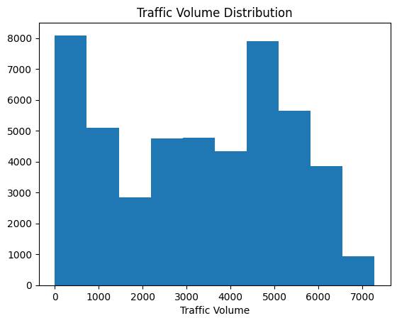
Learning Insight: Always label your axes and add titles! Your audience shouldn’t have to guess what they’re looking at. A graph without context is just pretty colors.
The histogram reveals a striking bimodal distribution with two distinct peaks:
- One peak near 0-1,000 vehicles (low traffic)
- Another peak around 4,000-5,000 vehicles (high traffic)
This suggests two distinct traffic regimes. My immediate hypothesis: these correspond to day and night traffic patterns.
Day vs. Night Analysis
Let’s test our hypothesis by splitting the data into day and night periods:
# Convert date_time to datetime format
traffic['date_time'] = pd.to_datetime(traffic['date_time'])

# Create day and night dataframes
day = traffic.copy()[(traffic['date_time'].dt.hour >= 7) &
                     (traffic['date_time'].dt.hour < 19)]

night = traffic.copy()[(traffic['date_time'].dt.hour >= 19) |
                       (traffic['date_time'].dt.hour < 7)]
Learning Insight: I chose 7 AM to 7 PM as “day” hours, which gives us equal 12-hour periods. This is somewhat arbitrary and you might define rush hours differently. I encourage you to experiment with different definitions, like 6 AM to 6 PM, and see how it affects your results. Just keep the periods balanced to avoid skewing your analysis.
Now let’s visualize both distributions side by side:
plt.figure(figsize=(11,3.5))

plt.subplot(1, 2, 1)
plt.hist(day['traffic_volume'])
plt.xlim(-100, 7500)
plt.ylim(0, 8000)
plt.title('Traffic Volume: Day')
plt.ylabel('Frequency')
plt.xlabel('Traffic Volume')

plt.subplot(1, 2, 2)
plt.hist(night['traffic_volume'])
plt.xlim(-100, 7500)
plt.ylim(0, 8000)
plt.title('Traffic Volume: Night')
plt.ylabel('Frequency')
plt.xlabel('Traffic Volume')

plt.show()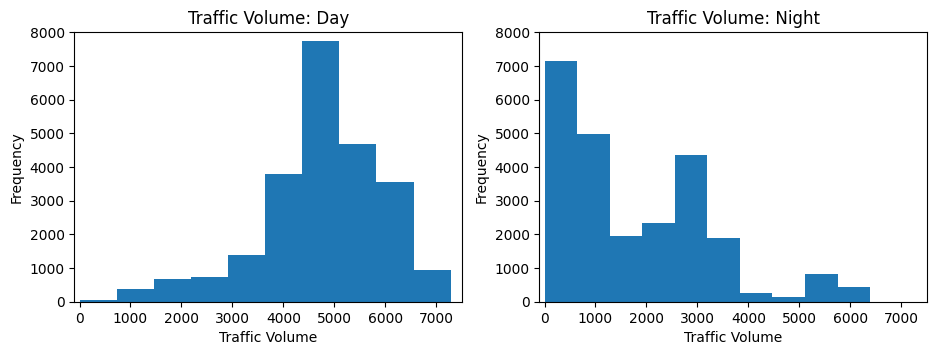
Perfect! Our hypothesis is confirmed. The low-traffic peak corresponds entirely to nighttime hours, while the high-traffic peak occurs during daytime. Notice how I set the same axis limits for both plots—this ensures fair visual comparison.
Let’s quantify this difference:
print(f"Day traffic mean: {day['traffic_volume'].mean():.0f} vehicles/hour")
print(f"Night traffic mean: {night['traffic_volume'].mean():.0f} vehicles/hour")
Day traffic mean: 4762 vehicles/hour
Night traffic mean: 1785 vehicles/hourDay traffic is nearly 3x higher than night traffic on average!
Monthly Traffic Patterns
Now let’s explore seasonal patterns by examining traffic by month:
day['month'] = day['date_time'].dt.month
by_month = day.groupby('month').mean(numeric_only=True)

plt.plot(by_month['traffic_volume'], marker='o')
plt.title('Traffic volume by month')
plt.xlabel('Month')
plt.show()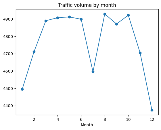
The plot reveals:
- Winter months (Jan, Feb, Nov, Dec) have notably lower traffic
- A dramatic dip in July that seems anomalous
Let’s investigate that July anomaly:
day['year'] = day['date_time'].dt.year
only_july = day[day['month'] == 7]

plt.plot(only_july.groupby('year').mean(numeric_only=True)['traffic_volume'])
plt.title('July Traffic by Year')
plt.show()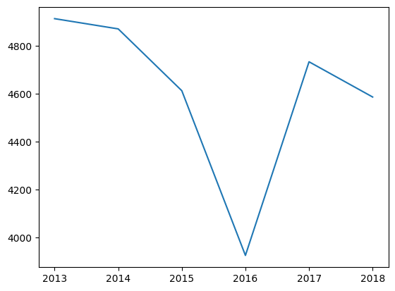
Learning Insight: This is a perfect example of why exploratory visualization is so valuable. That July dip? It turns out I-94 was completely shut down for several days in July 2016. Those zero-traffic days pulled down the monthly average dramatically. This is a reminder that outliers can significantly impact means so always investigate unusual patterns in your data!
Day of Week Patterns
Let’s examine weekly patterns:
day['dayofweek'] = day['date_time'].dt.dayofweek
by_dayofweek = day.groupby('dayofweek').mean(numeric_only=True)

plt.plot(by_dayofweek['traffic_volume'])

# Add day labels for readability
days = ['Mon', 'Tue', 'Wed', 'Thu', 'Fri', 'Sat', 'Sun']
plt.xticks(range(len(days)), days)
plt.xlabel('Day of Week')
plt.ylabel('Traffic Volume')
plt.title('Traffic by Day of Week')
plt.show()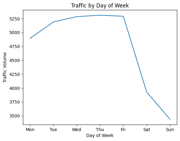
Clear pattern: weekday traffic is significantly higher than weekend traffic. This aligns with commuting patterns because most people drive to work Monday through Friday.
Hourly Patterns: Weekday vs. Weekend
Let’s dig deeper into hourly patterns, comparing business days to weekends:
day['hour'] = day['date_time'].dt.hour
business_days = day.copy()[day['dayofweek'] <= 4]  # Monday-Friday
weekend = day.copy()[day['dayofweek'] >= 5]        # Saturday-Sunday

by_hour_business = business_days.groupby('hour').mean(numeric_only=True)
by_hour_weekend = weekend.groupby('hour').mean(numeric_only=True)

plt.figure(figsize=(11,3.5))

plt.subplot(1, 2, 1)
plt.plot(by_hour_business['traffic_volume'])
plt.xlim(6,20)
plt.ylim(1500,6500)
plt.title('Traffic Volume By Hour: Monday–Friday')

plt.subplot(1, 2, 2)
plt.plot(by_hour_weekend['traffic_volume'])
plt.xlim(6,20)
plt.ylim(1500,6500)
plt.title('Traffic Volume By Hour: Weekend')

plt.show()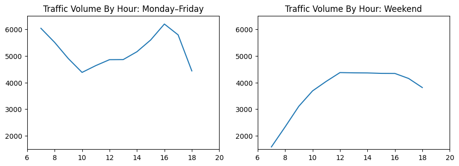
The patterns are strikingly different:
- Weekdays: Clear morning (7 AM) and evening (4-5 PM) rush hour peaks
- Weekends: Gradual increase through the day with no distinct peaks
- Best time to travel on weekdays: 10 AM (between rush hours)
Weather Impact Analysis
Now let’s explore whether weather conditions affect traffic:
weather_cols = ['clouds_all', 'snow_1h', 'rain_1h', 'temp', 'traffic_volume']
correlations = day[weather_cols].corr()['traffic_volume'].sort_values()
print(correlations)
clouds_all -0.032932
snow_1h 0.001265
rain_1h 0.003697
temp 0.128317
traffic_volume 1.000000
Name: traffic_volume, dtype: float64Surprisingly weak correlations! Weather doesn’t seem to significantly impact traffic volume. Temperature shows the strongest correlation at just 13%.
Let’s visualize this with a scatter plot:
plt.figure(figsize=(10,6))
sns.scatterplot(x='traffic_volume', y='temp', hue='dayofweek', data=day)
plt.ylim(230, 320)
plt.show()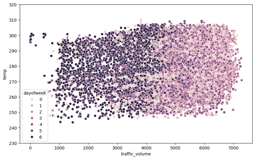
Learning Insight: When I first created this scatter plot, I got excited seeing distinct clusters. Then I realized the colors just correspond to our earlier finding—weekends (darker colors) have lower traffic. This is a reminder to always think critically about what patterns actually mean, not just that they exist!
Let’s examine specific weather conditions:
by_weather_main = day.groupby('weather_main').mean(numeric_only=True).sort_values('traffic_volume')

plt.barh(by_weather_main.index, by_weather_main['traffic_volume'])
plt.axvline(x=5000, linestyle="--", color="k")
plt.show()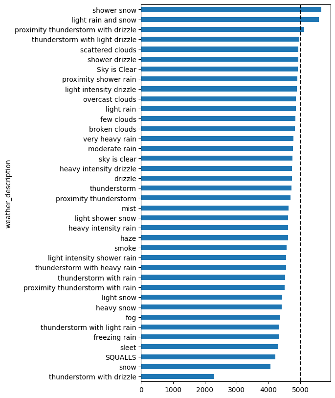
Learning Insight: This is a critical lesson in data analysis and you should always check your sample sizes! Those weather conditions with seemingly high traffic volumes? They only have 1-4 data points each. You can’t draw reliable conclusions from such small samples. The most common weather conditions (clear skies, scattered clouds) have thousands of data points and show average traffic levels.
Key Findings and Conclusions
Through our exploratory visualization, we’ve discovered:
Time-Based Indicators of Heavy Traffic:
- Day vs. Night: Daytime (7 AM – 7 PM) has 3x more traffic than nighttime
- Day of Week: Weekdays have significantly more traffic than weekends
- Rush Hours: 7-8 AM and 4-5 PM on weekdays show highest volumes
- Seasonal: Winter months (Jan, Feb, Nov, Dec) have lower traffic volumes
Weather Impact:
- Surprisingly minimal correlation between weather and traffic volume
- Temperature shows weak positive correlation (13%)
- Rain and snow show almost no correlation
- This suggests commuters drive regardless of weather conditions
Best Times to Travel:
- Avoid: Weekday rush hours (7-8 AM, 4-5 PM)
- Optimal: Weekends, nights, or mid-day on weekdays (around 10 AM)
Next Steps
To extend this analysis, consider:
- Holiday Analysis: Expand holiday markers to cover all 24 hours and analyze holiday traffic patterns
- Weather Persistence: Does consecutive hours of rain/snow affect traffic differently?
- Outlier Investigation: Deep dive into the July 2016 shutdown and other anomalies
- Predictive Modeling: Build a model to forecast traffic volume based on time and weather
- Directional Analysis: Compare eastbound vs. westbound traffic patterns
This project perfectly demonstrates the power of exploratory visualization. We started with a simple question, “what causes heavy traffic?,” and through systematic visualization, uncovered clear patterns. The weather findings surprised me; I expected rain and snow to significantly impact traffic. This reminds us to let data challenge our assumptions!
Pretty graphs are nice, but they’re not the point. The real value of exploratory data analysis comes when you dig deep enough to actually understand what’s happening in your data that will allow you can make smart decisions based on what you find. Whether you’re a commuter planning your route or a city planner optimizing traffic flow, these insights provide actionable intelligence.
If you give this project a go, please share your findings in the Dataquest community and tag me (@Anna_Strahl). I’d love to see what patterns you discover!
Happy analyzing!